less generic faces?
© 2019 Kittykatc
Done as part of a 30 minute class.
My current goal is: Reduce stiffness and make my drawings feel more dynamic, energetic, fluid. improve proportion accuracy
edit: thanks for the helpful comments and even images, the feedback is ecouraging and constructive.
 Rosa M. Franke
Hey there!
Great job at the smiling one, even though the mouth seems a tiny bit misaligned!
As for the 3/4 (not exactly but very close) view portrait! But here you should practice a bit and analyze where the cheekbone is, how the nose and nostrils look from that perspective. I assume you portrayed a woman here, so I take advantage of a famous sketch to show, what I mean!

Look at the subtle outline of her face and mind how it makes subtle curves around the area where her mouth is. Also, take a look at where her cheekbones are: beneath the eyes. Yours seemed a bit too low.
To prove my point further as well as making it better understandable take a look at this (the fourth from left to right in the top row is the one most interesting in this case):

Don't try to skip steps and work on the basics first! You'll see much more progress in less time if you take one step after another!
Still, I want to give you advice on working on less generic faces. Sometimes it is easier to just let your medium work for you, therefore I would want to ask you to get a rougher line and a rather loose wrist! Try to avoid stippling lines, you are on the verge of breaking free from the mindset of getting things perfect! I can see rough, easy and fast lines within your sketch, but also the moments, where you want to make it perfect and then tend to stipple. Start off with very fast sketches (30 seconds each) and then longer ones etc. until you reach a 30 min. Portrait session. While sketching and trying to get forms laid down fast try and break up the human face into parts/ other forms. Observe, how others do so:


 Whoops, this a kinda small... :(
Now let's get to "let the medium work for you" as you draw, do not hesitate to make mistakes. I suppose you know Bob Ross's phrase including "happy little accidents", that is what you should be going for. Just let you hand drift across the paper/ canvas/ etc. and find out what happens. Don't be restrained by the will to do it perfectly right!
And then, when the mistakes happened, observe! What makes this special line different from the others? Thickness? The speed at which you drew? Is it straighter than others or more wobbly? Is a feature a little off or exaggerated thus gives off a special impression and works for you or rather against you? Ask yourself such questions and find out, what you want to replicate and what you want to throw overboard.
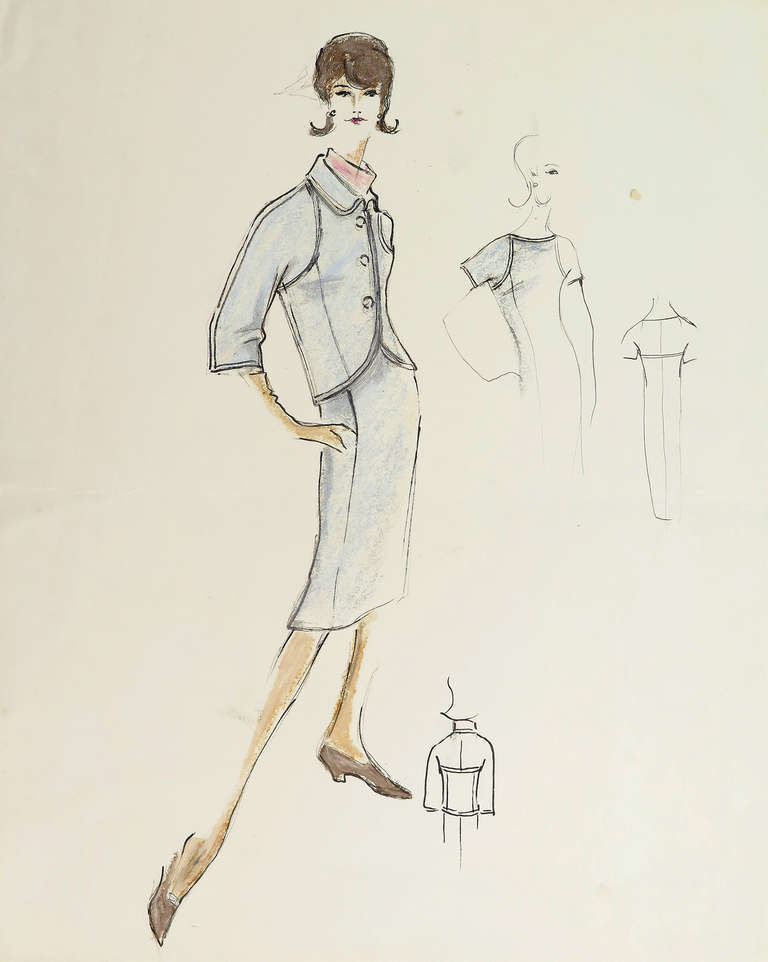
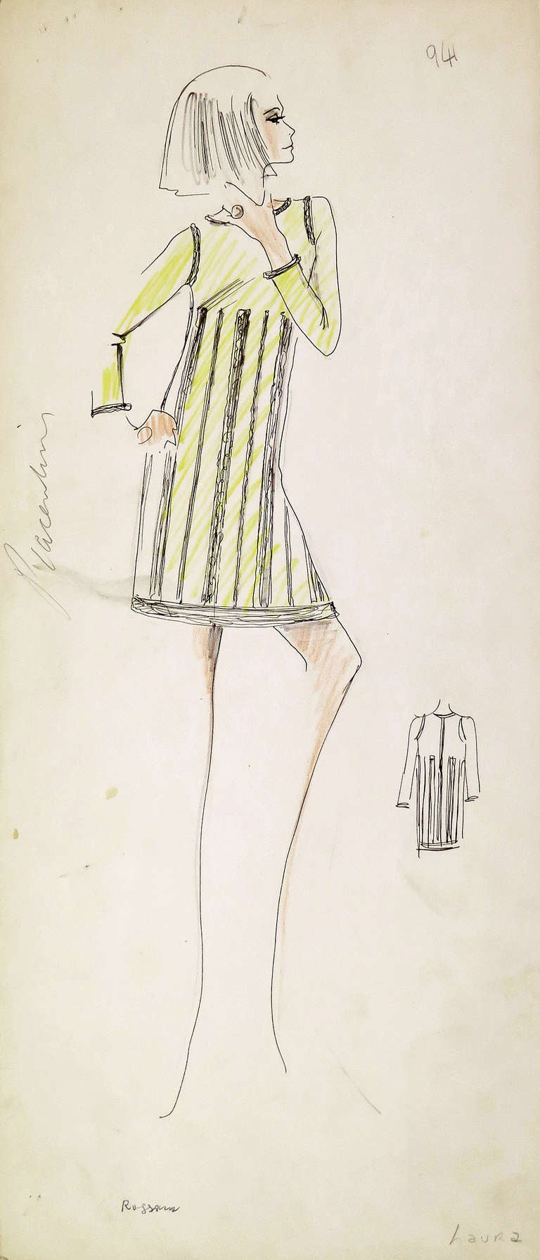
I want to show you two examples of drawings by Karl Lagerfeld. Take a close look at how he was able to draw a clear pose using only very few lines! Fast lines, with direction.
The woman in the blue costume has a leg far too long, but is it really that bad? It works for the pose!


When you draw you should also add shadows (stippled, shaded, dotted, in whatever way you want them to be) just to add more depth.

Take a look at her cheeks and the subtle shadows.

Take it to the extreme with high contrasts! Look at the spot between eyes and nose, and how there is only black that makes up a plain!
I hope all of this helps. It is much, sorry.
You do a great job, keep it up bub!
Great job at the smiling one, even though the mouth seems a tiny bit misaligned!
As for the 3/4 (not exactly but very close) view portrait! But here you should practice a bit and analyze where the cheekbone is, how the nose and nostrils look from that perspective. I assume you portrayed a woman here, so I take advantage of a famous sketch to show, what I mean!

Look at the subtle outline of her face and mind how it makes subtle curves around the area where her mouth is. Also, take a look at where her cheekbones are: beneath the eyes. Yours seemed a bit too low.
To prove my point further as well as making it better understandable take a look at this (the fourth from left to right in the top row is the one most interesting in this case):

Don't try to skip steps and work on the basics first! You'll see much more progress in less time if you take one step after another!
Still, I want to give you advice on working on less generic faces. Sometimes it is easier to just let your medium work for you, therefore I would want to ask you to get a rougher line and a rather loose wrist! Try to avoid stippling lines, you are on the verge of breaking free from the mindset of getting things perfect! I can see rough, easy and fast lines within your sketch, but also the moments, where you want to make it perfect and then tend to stipple. Start off with very fast sketches (30 seconds each) and then longer ones etc. until you reach a 30 min. Portrait session. While sketching and trying to get forms laid down fast try and break up the human face into parts/ other forms. Observe, how others do so:


 Whoops, this a kinda small... :(
Now let's get to "let the medium work for you" as you draw, do not hesitate to make mistakes. I suppose you know Bob Ross's phrase including "happy little accidents", that is what you should be going for. Just let you hand drift across the paper/ canvas/ etc. and find out what happens. Don't be restrained by the will to do it perfectly right!
And then, when the mistakes happened, observe! What makes this special line different from the others? Thickness? The speed at which you drew? Is it straighter than others or more wobbly? Is a feature a little off or exaggerated thus gives off a special impression and works for you or rather against you? Ask yourself such questions and find out, what you want to replicate and what you want to throw overboard.
I want to show you two examples of drawings by Karl Lagerfeld. Take a close look at how he was able to draw a clear pose using only very few lines! Fast lines, with direction.
The woman in the blue costume has a leg far too long, but is it really that bad? It works for the pose!


When you draw you should also add shadows (stippled, shaded, dotted, in whatever way you want them to be) just to add more depth.

Take a look at her cheeks and the subtle shadows.

Take it to the extreme with high contrasts! Look at the spot between eyes and nose, and how there is only black that makes up a plain!
I hope all of this helps. It is much, sorry.
You do a great job, keep it up bub!


Your faces are very expressive and I think that going straight in with a pen is a great idea for making your drawings more fluid. When you take away the option to erase, you force yourself to be more confident in your marks, and I can definitely see that confidence coming through here.
You mentioned generic faces in your title. I only see two here, of course, so I can't comment on whether your art suffers from "same face syndrome". But if this is something you are looking to actively avoid, I have a good warm-up activity for you to try. Pick a facial feature (e.g. nose, mouth, eyes etc.) then draw it over and over in as many different ways as you can. Don't worry if they are good, or in your style or anything. The idea is just to expand your mental encyclopedia of facial features. Here, I drew a quick one with noses to show you what I mean (assuming this image insert feature works):
[img]%3Cimg%20src=[/img]" alt="" data-mce-id="__mcenew">
Your drawings here are very expressive and it's great that you also took the time to lightly mark in some underdrawing. Drawing in a circle for the ear is an especially nice touch, as it is a common mistake for people to misplace it slightly. That's great forward planning.
You're doing really well. Keep it up!