Forum posts by Zhaoxiong

  • Author
    Posts
  • #29182

    Great sketches! They really communicate the emotion well, especially in the figures that are hunched over.

    Try "readign" more and "writing" less, for example, try a blind gesture drawing where you only look at the reference while drawing and never look down at your sketch (it's supposed to look crazy). In the middle piece, see the circles you indicated for the knees? To me, that's an example of you thinking "legs are like 2 cylinders joined by a sphere". Yes, that's important to help us sort out our visual ideas, but too much of it and you risk losing/ignoring the reference. What's the point of reference if you already know what's there?

    1 1
    #29181

    Reminds me of my attempts at painting rather than sketching! I recommend first off that you use reference if you are not already.

    I suggest you simplify, the shapes and likeness is there! But it feels muddied at times, I think because you are trying too many shapes and colors at the same time. Try a 2-tone or 3-tone piece. For 3 tone, that would be base, light, and shadow. Look at comics & manga for inspiration. They get away with a lot by doing very little.

    By simplifying into fewer colors, you force yourself to "edit" the picture more; to digest it and then re-render it your own way. Always look out for shapes that can be unified together into a larger one.

    1 1
    #29153

    https://imgur.com/a/v7ehSSa

    Hi, I did one of my first hands & feet classes today (have done a decent amount of figure/portrait in the past). This was very challenging for me! Especially with hands, the complexity of the fingers really challenged my ability to visually organize shapes. I think this is more obvious in the shorter duration sketches. I try to simplify sometimes, but find it hard to strike a balance between too simple (and the emotion/complexity of the subject disappears) and too complex (no time to render). In my head, I either get caught up with thinking of 15 segments (5 fingers x 3 bones) or I'm thinking in terms of broad lines that leave me kind of in a dead end.

    I think in my 2nd 5min piece and my 10min piece, once I was able to calm down and really dive deep on focus, I could punch out a good shape. I learned a lot of lessons, namely the complexity of the wrist area. There's a lot of subtle curves that are difficult to imagine without reference. Overall, I'm fairly satisfied, but I'm left wanting of more concise takeaway lessons. I feel like other than learning "this is hard!" I havent walked away with much concrete ideas.

    All the best,

    ZX

    #29152

    Wow! Great sketches. Your enegy, dynamism, and expression are fantastic, each sketch is clear and immeidately invokes an emotion. I especially love that you don't shy away from mixing lines (a graphic approach) with values (a painterly approach) and indicate shading, even if it's just two tone.

    If you want to challenge yourself, I suggest changing your style to a more realistic one. Currently, it's more cartoonish (the size of the eyes, the exaggeration of the eyebrows, and the stylization of the teeth into blocks). As you change your style out of your comfort zone, I think it'll help you in your future sketches.

    Another nitpick is the blue man's back, I find the muscles hard to read, perhaps due to the lack of a spine or a clearly hierarchy. In life, muscles are often very irregular, but maybe for a painting, you want to "edit" life a bit to give a clear hierachy of the muscles based on size or tenseness.

    -ZX

    1 1
    #28743

    Hi Kanji,

    Trust your intuition! These absolutely look great. If you think they look "wrong" then try exaggerating the poses, almost like a charicature. As you exaggerate the forms, you will notice when they get to be too much, and exploring that dimension will help you anchor yourself to what's "right".

    You do a great job capturing the emotion of each pose. If you're looking for more, I would try indicating the pose of the head more, such as drawing a cross to represent the eyes/nose. By showing where the head is pointing, the pose will become more complete. You already indicate the head well with the placement of the neck line. This could be something additionally.

    -ZX

    1 1
    #28154

    https://imgur.com/a/w1OiepW

    grid layout (though I uploaded as transparent PNGs, so you can't see them on the black background...): https://imgur.com/a/w1OiepW/layout/grid

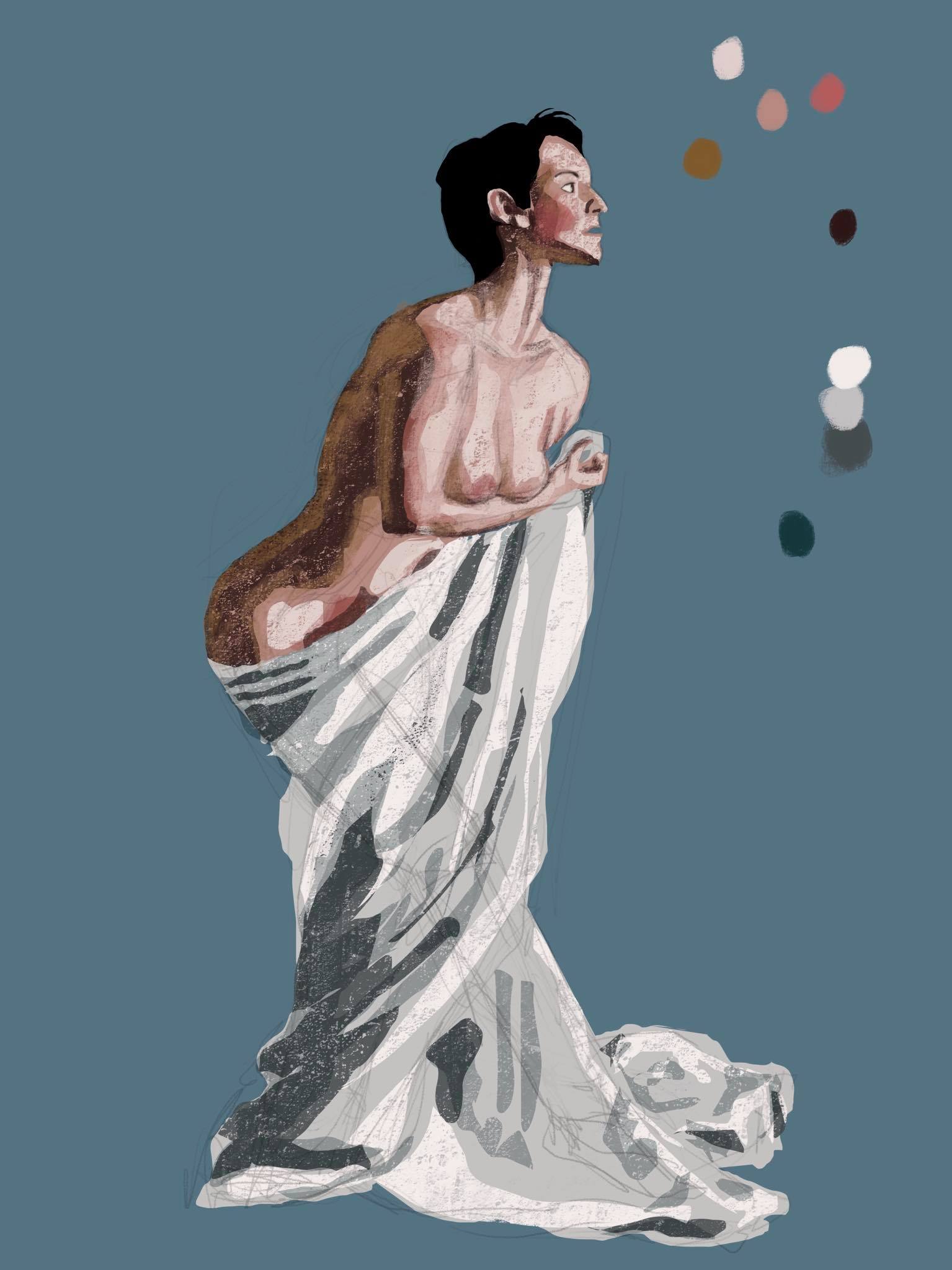
    A collection of drawings from mostly the 1.5 hr class.

    For short sketches (30s or 1m) I think my prioritizing can use improvement. I don't think I'm good at capturing the basic likeness or emotion of a face quickly -- and part of that I think I'm not good at simplifying and grouping shapes.

    For longer pieces, I want to work on the transition point between drawing and more painterly approaches. In two of 20m pieces, I went with a painterly approach from the beginning, which looks fine but results in lack of detail. In the pieces where I do line drawing first then value shading (my default approach), I think it can end up looking disjointed between the two styles.

    Thanks for looking through this long gallery and giving me feedback! These are just some thoughts of mine, open to all feedback.

    #27763

    Are you drawing from reference or from your imagination? I'm assuming you're drawing from reference. First, I suggest that you also try the quicker time frames, like 30s, 1m, 5m. By drawing across time frames you build up your sensitivity to what's important to any given piece. In a creative writing class, my professor once gave a prompt that was: "write a story in 500 words, then write it again in 250 words, then write it again in 125 words". I loved that prompt and I think shorter times are the visual equivalent.

    Another suggestion is for you to forget labels when drawing faces and do more "monkey-see, monkey-do" drawing. I noticed that your proportions for animals are better than for faces, I think this is because when we see faces, a special part of our brain activates and we think "thats an eye, that's a nose" which naturally leads to us enlarging and misplacing these features according to their importance rather than real location. We're deconstructing the face as we see it! Instead, if you ignore "eyes, nose, mouth" and instead focus on "edges, corners, curves" then you will be able to draw more accurating.

    You paintings have a dynamic energy to them! I can immediately feel the emotion of each reference, that's a terrific starting point.

    2
    #27758

    Hi Eevee, great drawings! Your drawings are stylized and fun! I especially like how you "draw through", aka how you draw not just what is visible, but also the forms that are not visible but lead to what is visible. For example, you pencil in the hidden parts of the pelvis or the left leg.

    Regarding the torso, I've seen broadly 2 basic approaches. The two box method that others have mentioned (1 for the ribcage and 1 for the pelvis). To me, this method usually produces a more masculine figure. The egg and cradle method (I just made the name up) uses an egg shape for the ribcage and a bowl or cradle or saddle for the pelvis. This usually produces a more feminine figure.

    #27675

    I'm fairly satisfied with my ability to draw proportions, outlines, and shape correctly, but I think I struggle significantly with color and color theory. Specifically, in this piece I think I did a fine job rendering the overall feel and everything reads, but the global values are not well done. Ex: the backside of the cloth should be darker, and I think I only hit the really dark shadows. The blending and color of the woman's skin also leave a lot to be desired by me.

    I'm now using a highly textured brush and the lasso tool, and I feel like I have a greater grasp than the round brush.

    #27673

    I suggest more gesture drawing, more speed and scribbling, especially in the 30 second and 1 min warm up pieces. By focusing on just the outline your pieces can be rigid. Also try out blind drawing (where you only look at the reference and not your own piece).

    One specific part is in your last piece you see that you fill in the shorts and top. Imo this kind of "left brain" practice (Dr. Edwards) can be bad because it means you thought "this shape represents the shorts, let me just fill it in". But if you forget symbols and objects, and go down to the level of just shades, lines, curves, I bet there are actually many curves and forms hidden in the shorts. Her buttocks, hips, etc.

    #27672

    I suggest you take more risk with this piece. Try this, make a copy of this piece (so you will have no qualms about totally messing it up) and throw in some big pieces of color using a textured brush and the lasso select tool. Right now, there is not enough range in my eyes (the whole piece is very dark). If the reference is this dark, then perhaps just ignore that feedback (it will be hard to correct).

    Try to identify constants in your process and change them--for better or for worse. Ex: if you are always using a few brushes, try totally new ones. If you always shading with a multiply layer try blending instead.

    The confidence thing I struggle with as well. For long time I've wanted to make an insta to showcase my art but I am afraid. So instead I made a website first (bc then only ppl I send the link will see) and I'm hoping that helps me build confidence over time. Slow and steady, but constant & repeated stepping outside my comfort zone.

    #27670

    I was working on a picture of a woman in cloth when my line of action class ended (the timer was up). Is there a way to find that picture again? Like either by downloading all the publically available pictures or otherwise browsing through all the photos?