Hi pizqit :-)
When I have drawn sketches or just gestures, I have noticed they are incredibly believable if I have caught perspective and the effects of gravity in a believable fashion. That doesn't happen so often at the moment. Once I understood the importance of these two factors, I began understanding what little importance other factors (especially lighting -- or more specifically shading) have on the observer.
- The effect of gravity I gain with the correct execution of the line of action.
- The effect of perspective is sometimes enhanced by the slightest of a curve at the correct moment just in one line.
With many lines (e.g. via shading) and many curves, the observer and even myself as the creator, are distracted albeit confused. And I may not even notice until a few weeks later (when the image of the reference fades from my mind's eye) that gravity/line of action and perspective were simply not convincingly copied.
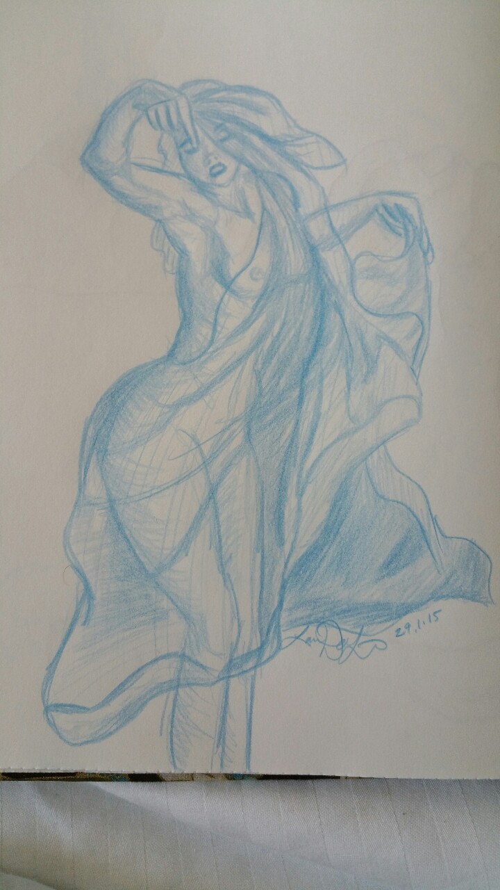
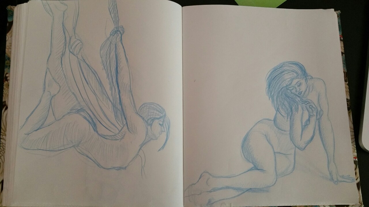
I liked your lady dancing with the silk cloth and the lady twisted on the floor a lot, but ask yourself like I did, especially with the silken lady, if you are perhaps using too much effort with shading at this interval in your gesture drawing activities. I always find the twisted gestures the easier ones, it's so obvious to us artists/observers, where the line of action could be. The more static gestures are the troublesome ones, aren't they :-)
Don't try to "save" a sketch with shading. Save your time and go on to the next sketch/gestute. Your resulting sketches will be more convincing once you can catch the action and perspective even more believably than you can now.
Keep up the good work! Look forward to seeing more of your sketches.
Stu
--
If you'd like to see what I'm up to, visit me here:
http://wordslye.com


