Page d'accueil › Forums › La critique › Thatcher64’s improvement thread.
This topic contains 9 replies, has 7 voices, and was last updated by
Possumpetal
il y a 2 ans.
- S'abonner Favori
-
April 10, 2023 6:32am #29585Three finished drawings,from my road to improvement. Critiques are very much appreciated.
[url=https:/www.flickr.com/photos/63260400@N04/52806206368/in/dateposted-public/][img]https:/live.staticflickr.com/65535/52806206368_0ddbdfbeeb_k.jpg[/img][/url]">
[url=https:/www.flickr.com/photos/63260400@N04/52806163965/in/dateposted-public/][img]https:/live.staticflickr.com/65535/52806163965_113279c186_k.jpg[/img][/url]">
[url=https:/www.flickr.com/photos/63260400@N04/52806164080/in/dateposted-public/][img]https:/live.staticflickr.com/65535/52806164080_f3e4b60a4e_k.jpg[/img][/url]">
-
 Thatcher64
edited this post on April 10, 2023 3:47am.
Reason: broken links
-
 Thatcher64
edited this post on April 10, 2023 3:48am.
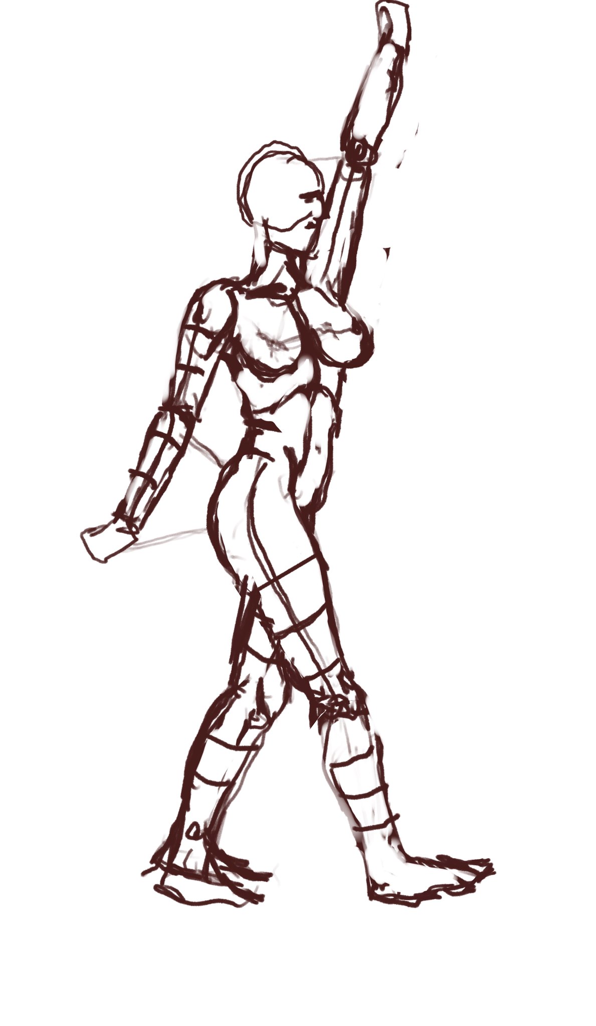
 April 10, 2023 5:32pm #29595Nicer job on your totally and absolutely finished pieces, Thatcherart, but where are the rough gesture sketches? How would you like to go for our online interactive tutorial, if you please, here? As a result, as a newly self-taught drawing student, you may learn some all-new habits for sketching and drawing. You can start yourself off with some quickest gestures, thus finishing off with the slowest drawing poses. So, my hat's off to you, and let's hope they have helped and benefited you, for a longer run.April 10, 2023 9:21pm #29597I just love the second drawing. Although I do suggest learning to angle heads more accurately.1April 11, 2023 12:27am #29598your drawings is very good, the first is very simple but it's works a lot, the shadows of the seconds are so realistic !! i think you need to try to work on anatomy, for that, you should try to use geometry form for begin, it help me a lot when i draw.1April 11, 2023 3:38am #29599Thanks everyone for the comments and feedback. I thought I would upload my process of setting up a drawing. This way you can maybe critique what I could improve on in the early stages to get a stronger final. Thanks again to everyone.
[url=https:/www.flickr.com/photos/63260400@N04/52808688780/in/dateposted-public/][img]https:/live.staticflickr.com/65535/52808688780_788bc9eda3_k.jpg[/img][/url]">
[url=https:/www.flickr.com/photos/63260400@N04/52808283101/in/dateposted-public/][img]https:/live.staticflickr.com/65535/52808283101_e1a5e0162f_k.jpg[/img][/url]">
[url=https:/www.flickr.com/photos/63260400@N04/52808485954/in/dateposted-public/][img]https:/live.staticflickr.com/65535/52808485954_b653f821c3_k.jpg[/img][/url]">
-
 Thatcher64
edited this post on April 11, 2023 12:39am.
Reason: broken links
April 13, 2023 7:17pm #29607I very much like the archer and the black and white portrait, ways to improve would be looking at the gesture of the poses as well as proportions of the face, since in the black and white portrait, the eyes do look a little bit big, and usually, there is a little shading to indicate different directions of the face (Shadows)
to get good at the proportions and a bit of gesture drawing since your poses look a little stiff, I recommend the Bridgman method: https://archive.org/details/GeorgeB.BridgmanConstructiveAnatomy/mode/2up
That being said these are amazing, keep up the good work!2April 18, 2023 5:24am #29612Hi!
your finished pieces are really good, I think you have a good sense of shading the body (especially the legs in the second picture) but I think that you should try some less static poses to really exhibit your shading talent. Even within the second pose, you are holding back a bit on how much you can enunciate the pose and really bring it to life. I'd also look into how shading clothes can differ from shading bodies cause they can be a bit difficult to differ but essential. Your faces seem very proportional and the shading is good on them, but the side profile on the second pic needs more of a forehead. Overall it's rlly good!!1April 19, 2023 4:47am #29617Thanks to everyone giving me feedback. Izzy thank you for the link to the Bridgman book. It really has some really good breakdowns of muscles.
Isa24, yes I agree I need to push my poses even more. I have been doing gesture practice daily,so slowly trying to improve.
My latest may not show my progress, but I created a drawing from Pinterest for practice. I picked it to focus on the face hands and feet more, which I struggle with.
[url=https:/www.flickr.com/photos/63260400@N04/52828477206/in/dateposted-public/][img]https:/live.staticflickr.com/65535/52828477206_617f6c25d5_b.jpg[/img][/url]">
-
 Thatcher64
edited this post on April 19, 2023 1:48am.
Reason: broken links
April 25, 2023 3:13pm #29628I absolutley love your pieces! My only critique is that the faces sometimes feel more cartoony than the rest of the body. Keep up the good work, I love your renderings and body anatomy so far!1 -
Login or create an account to participate on the forums.


