Critique request on digital 50m drawing of woman in cloth

Home Forums Critique Critique request on digital 50m drawing of woman in cloth

This topic contains 4 replies, has 4 voices, and was last updated by Wrenfy 2 years ago.

  • Subscribe Favorite
  • #27675

    I'm fairly satisfied with my ability to draw proportions, outlines, and shape correctly, but I think I struggle significantly with color and color theory. Specifically, in this piece I think I did a fine job rendering the overall feel and everything reads, but the global values are not well done. Ex: the backside of the cloth should be darker, and I think I only hit the really dark shadows. The blending and color of the woman's skin also leave a lot to be desired by me.

    I'm now using a highly textured brush and the lasso tool, and I feel like I have a greater grasp than the round brush.

    Students get 33% off full memberships to Line of Action

    Support us to remove this

    #27682

    Greatest job on your contrasts of colors and temperatures of the colors, zxding. Way to go, zxding!

    If you want my answer to that question, it could be to find this image on your computer's hard drive, then duplicate, and later put on a black-and-white fliter in order to judge the tones or values just a little bit better.

    The reason is because, it can help you ace your understanding of the lights, shadows, and the gestalt. And if you really need to learn more info. Look this video up>

    This video can help you.

    Cheers to you, and most of all, cheers to your current and future goals.

    Polyvios Animations

    #27692

    I feel that the shading on the back and underneath the jaw is a bit off.. i feel like if you replaced that yellowey-brownish backlight color with something a bit lighter, it would read better. also think if you added more contrasting shadows to more areas of the body, it would balance out the intensity of the back and jaw shadows. the overall shapes of the body are done well.

    #27712

    Hey! it's a beautiful work in progress. I feel ya on the struggle with colour theory and light - it's something I only recently started wrapping my head around after winging it for many years. My favourite videos on this are from Marco Bucci on youtube - https://www.youtube.com/user/marcobucci
    He breaks it down really succinctly. There are also many videos on texturing digital paintings that you might find interesting as well.

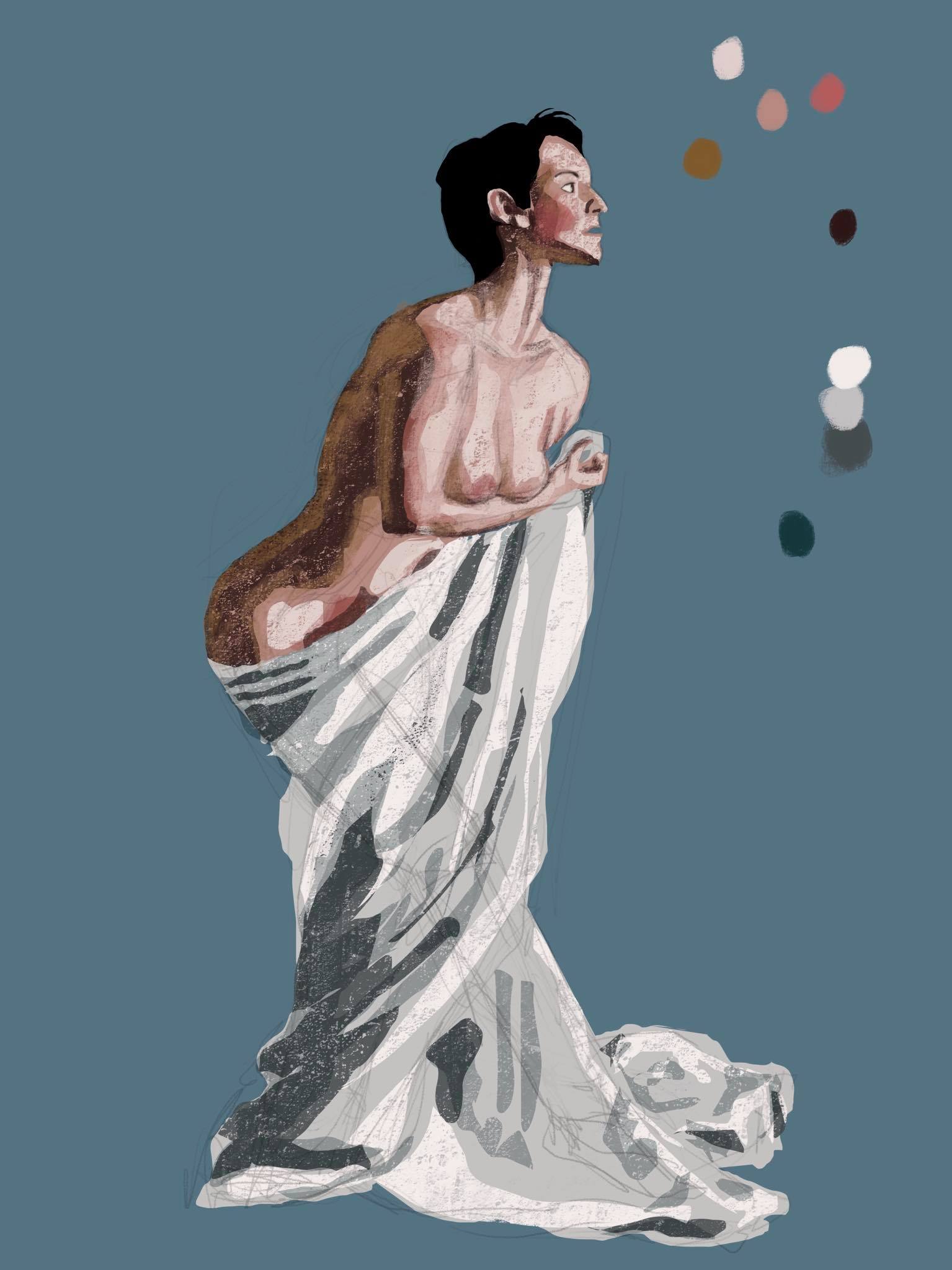
    I think the thing that most jumps out at me is the use of the bronze-gold colour to do your deepest shading with - it looks like she has metallic gold paint on her back, which I don't think is what you intended. Given the warmth of her skin and the cool blue of the background, you would expect it to dip into cooler shades like burnt umber and greys. Though generally, you should be able to use an unexpected colour if the values and shapes still read, but unfortunately it's also gotten a bit murkey in that area. Turning the original picture to black and white, and/or squinting or looking at it zoomed right out and really small are all handy tricks to get a sense of the overall values and shadow shapes.

    I feel like if you came back to this piece once you've done some study on light and colour, you would instantly see how to fix it, since you already have demonstrated a good understanding of proportion.

    Also - using the lasso tool to shade is definitely an advanced choice, as you need to have an accurate sense of the shapes and values of the shadows in order to have the pieces read well, so don't feel too bad if you are finding it a challenge. Good luck!

Login or create an account to participate on the forums.